Diamond Ice Cream

Diamond Ice Cream

Functional to Delightful: A Packaging Transformation Story

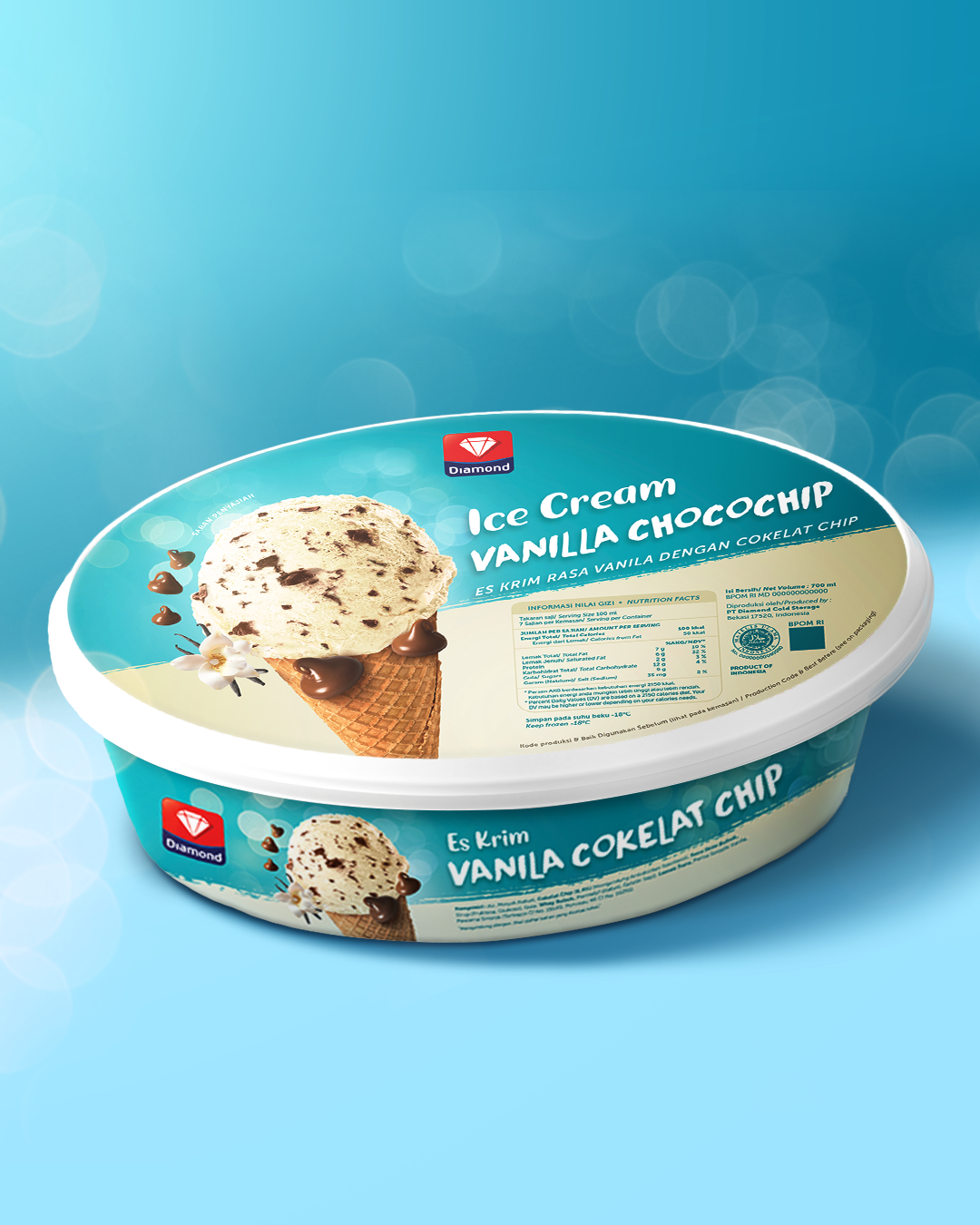
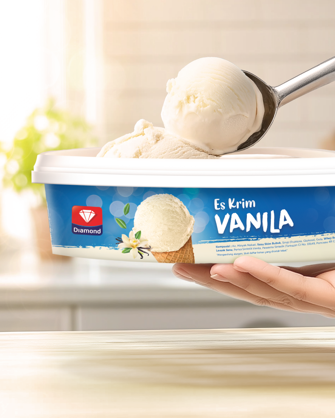
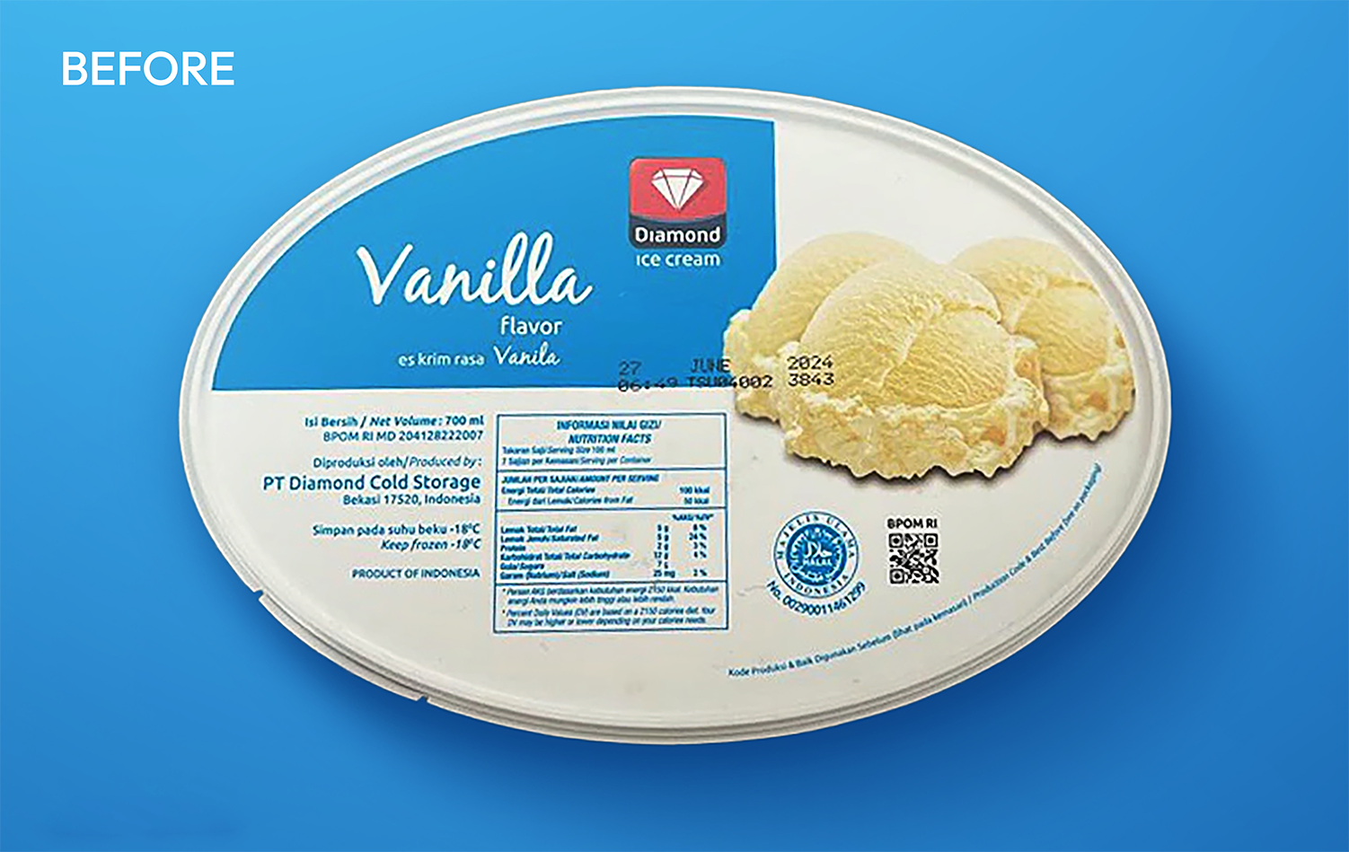
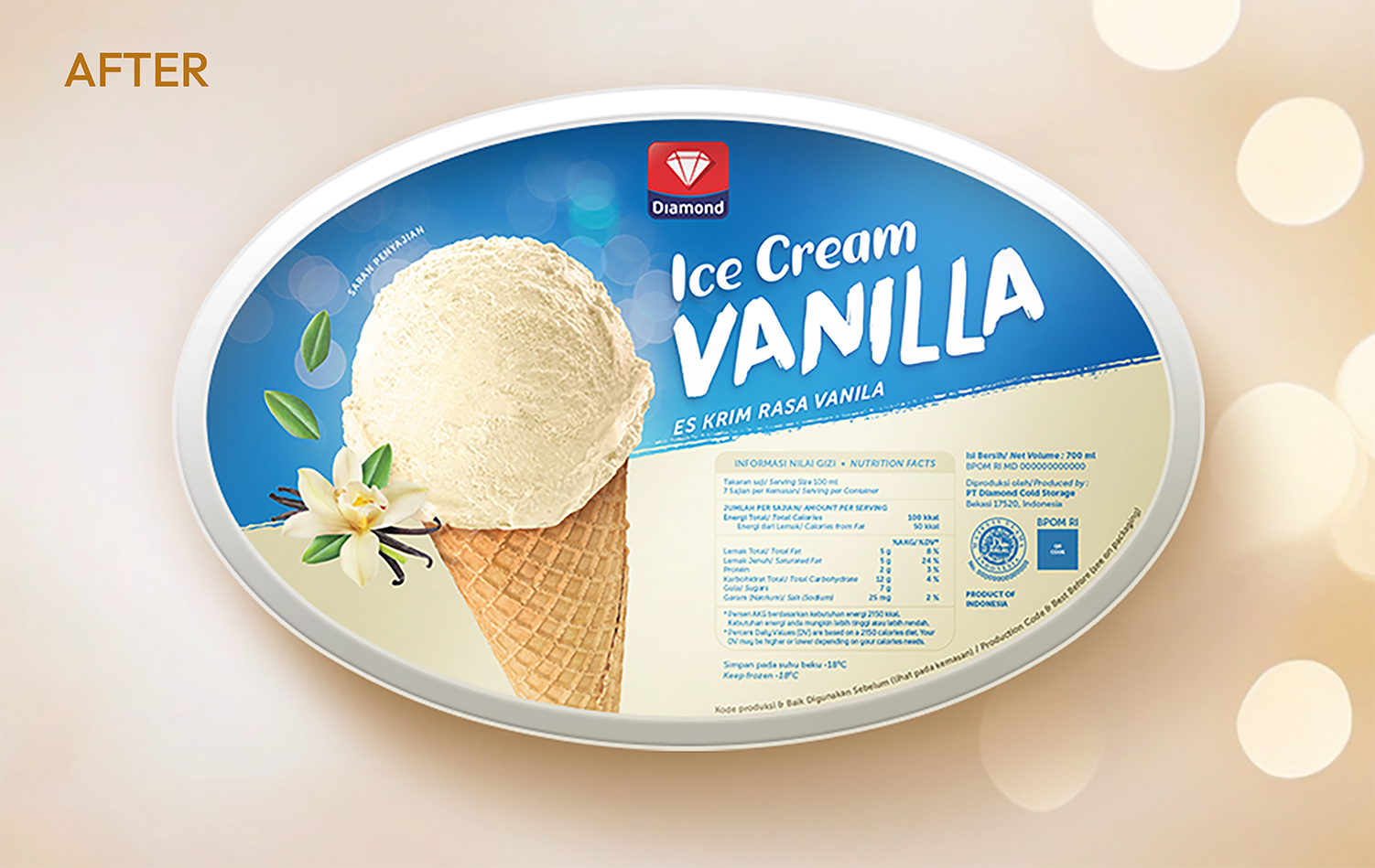
Diamond Ice Cream is a household icon, yet even timeless brands must evolve to stay relevant. Based on in-depth research with both loyalists and new users, we identified a “outdated look and feel” in the existing packaging that was preventing the brand from connecting with a younger, design-conscious audience.

BK_PORTFOLIO_DIAMOND MILK_CLOSE UP MOCKUP_WIP
BK_PORTFOLIO_DIAMOND MILK_CLOSE UP MOCKUP_WIP_3.22
BK_PORTFOLIO_DIAMOND MILK_CLOSE UP MOCKUP_WIP5

CHALLENGES

The challenge was modernizing 18 SKU variants while staying true to the brand's heritage. We solved this by widening the packaging lids for stronger shelf presence and replacing dated graphics with mouthwatering photography enhanced by a soft bokeh effect. This shift from "functional" to "delightful" creates a vibrant, consistent system that commands attention and triggers an immediate craving response.

BK_PORTFOLIO_DIAMOND-MILK_BEFORE
BK_PORTFOLIO_DIAMOND-MILK_AFTER