Qtela

Qtela

Rejuvenating The Biggest Indonesian Snack

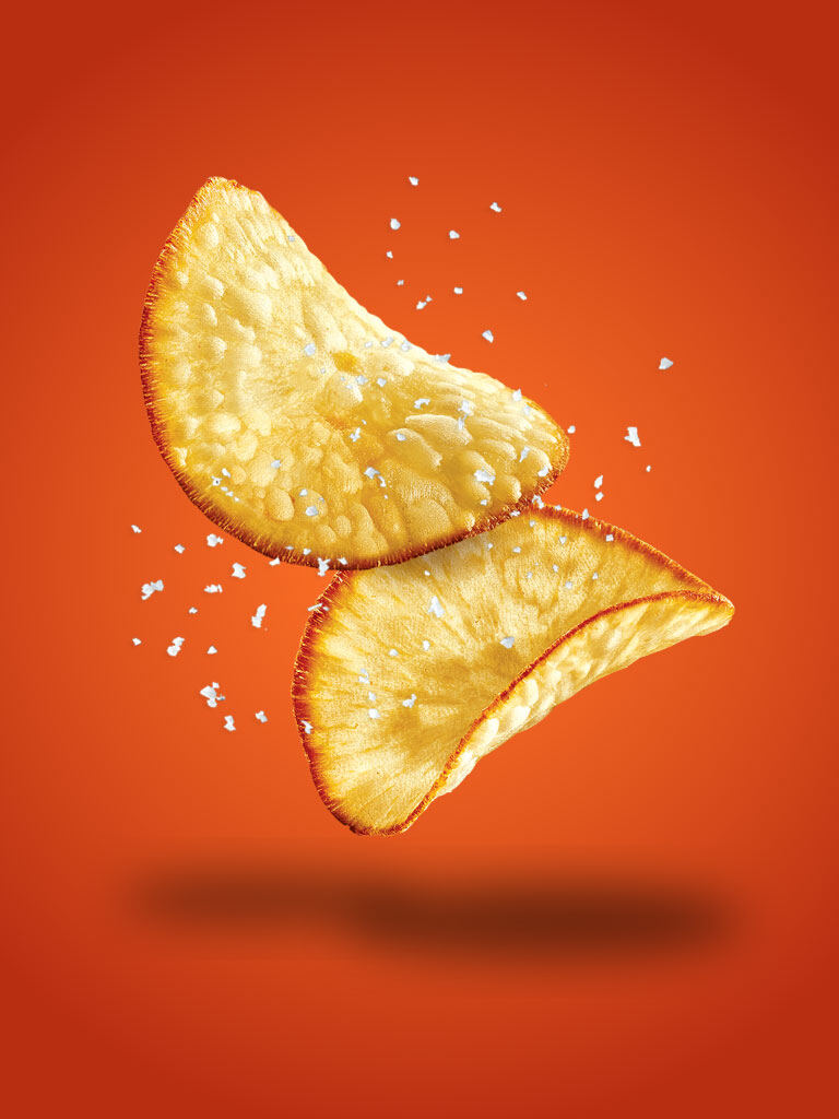
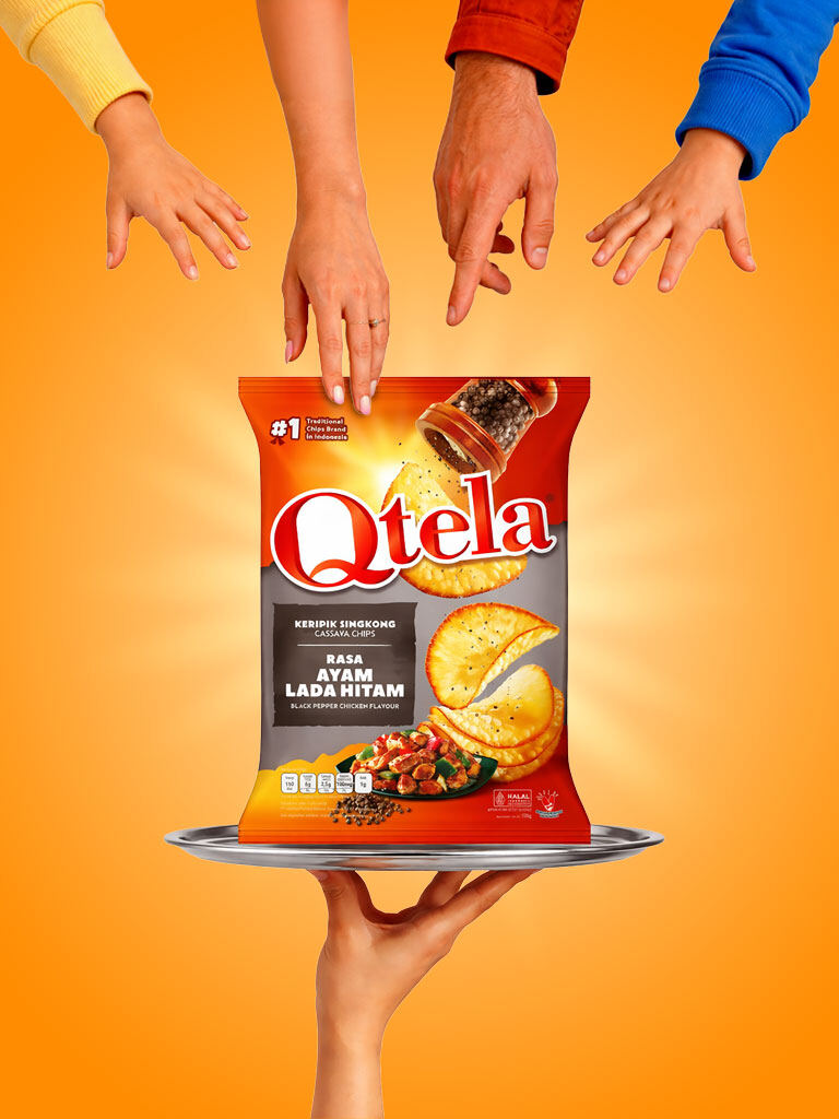
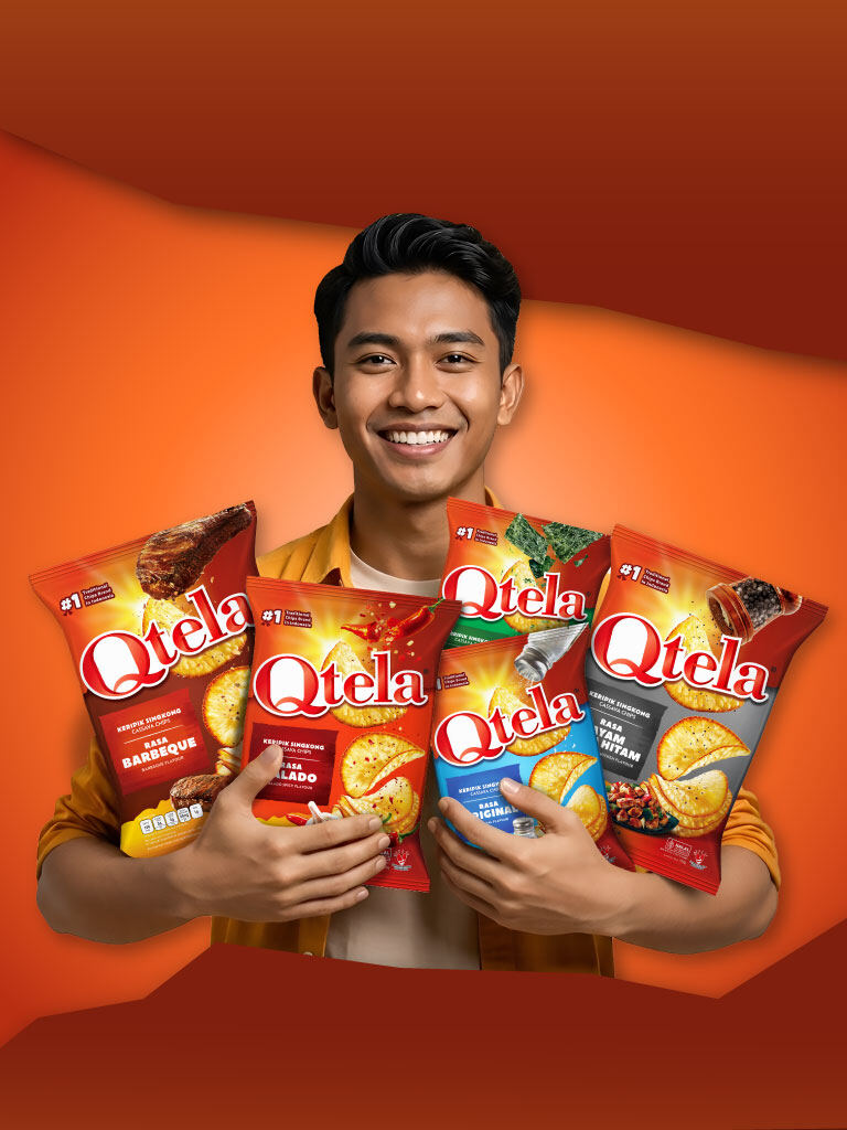
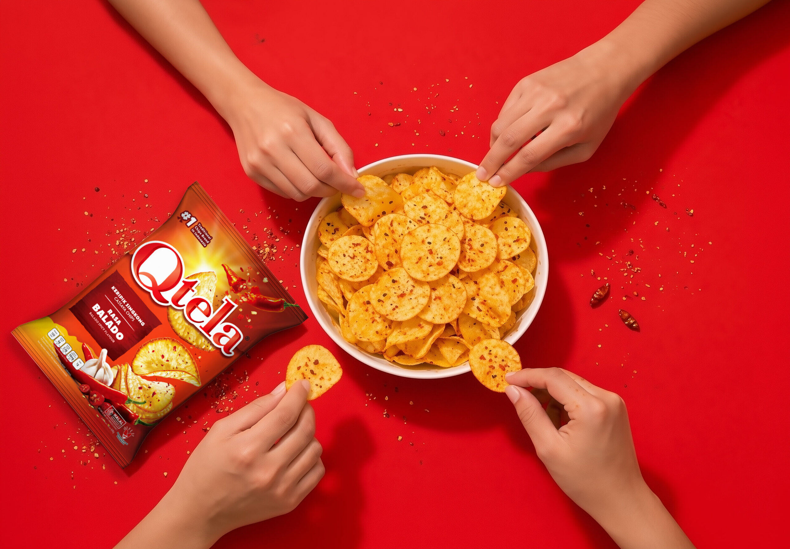
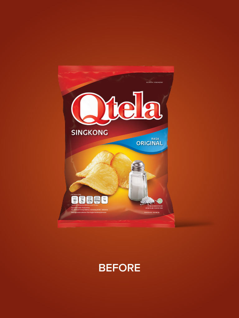
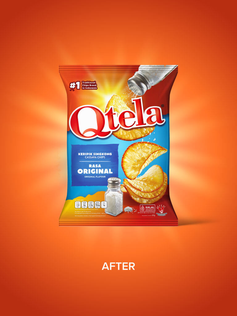
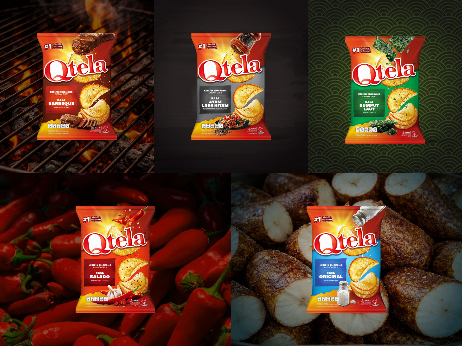
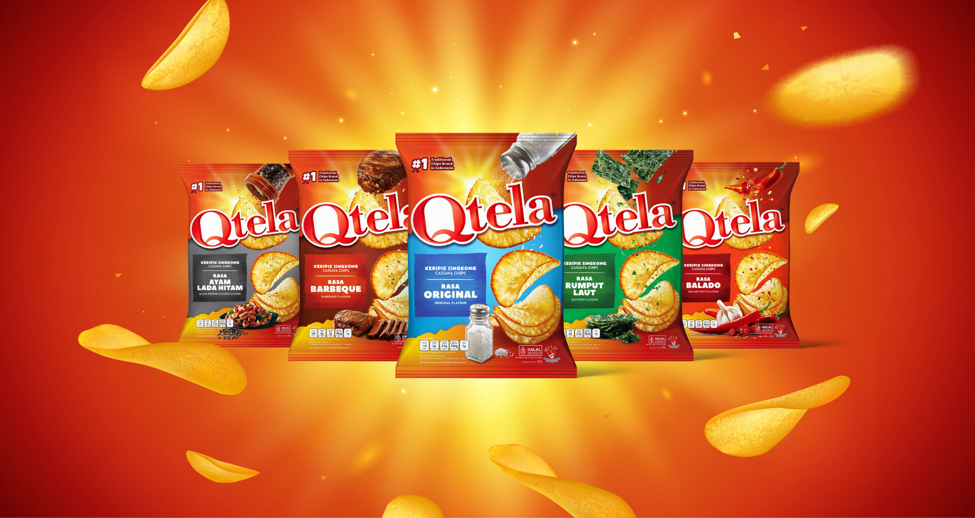
As one of Indonesia’s most recognizable cassava chip brands, Qtela has long been known for its bold flavors and local roots. With the growing demand for more visually engaging and contemporary snack brands, Qtela saw the need to refresh its hero product range—elevating its shelf presence while staying true to its identity as a proudly Indonesian snack.

Brandkraft was brought in to revamp the overall packaging system, creating a more impactful and modern visual language that resonates with today’s consumers.

Chips
Grabbing-Chip
Man-Holding-Chip
Reaching-into-Chip-Bowl

THE CHALLENGES

The main challenge was to modernize Qtela’s packaging without losing its strong brand recognition and mass appeal. In a highly competitive snack category, the design needed to stand out instantly on shelf—while clearly communicating flavor, texture, and indulgence.

We addressed this by introducing a distinctive “tear” concept as the core visual device. The torn element acts as a metaphor for opening a pack—capturing the anticipation and excitement of snacking. It also creates a dynamic frame that reveals the product in a more expressive, appetite-inducing way.

This approach transforms the packaging from static to sensory—where the visual itself feels interactive and immersive. Combined with bold colors, enhanced product photography, and a cleaner hierarchy, the new system delivers stronger shelf impact and a more contemporary, crave-driven appeal.

Before
After
Layout-Flavor